Hello, and welcome to the first post in my Ranked series. This series will allow me to rank various things that relate to the Chicago White Sox. I’m one of those weirdos that loves making lists and ranking things, so I am looking forward to this!
We start with Topps sets from the 1950s. Eventually I will rank all of the decades, which will culminate in a post ranking the 10 best Topps sets of all time.
Mostly I’m focusing on the design of the cards. I am also considering things like the presence of iconic rookie cards, and the overall Sox checklist in a particular set. I definitely prefer larger team sets!
Enough of my blathering, on with the list!
#9 – 1958 Topps
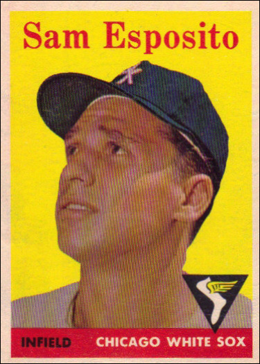
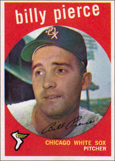
Definitely the least visually interesting of the 1950s sets, with only two other sets really in competition for the bottom spot. I’m really not into the yellow backgrounds. No particularly notable cards. Does contain a few Sox legends, such as Luis Aparicio and Billy Pierce, but many of the 50s sets have those guys.
#8 – 1955 Topps
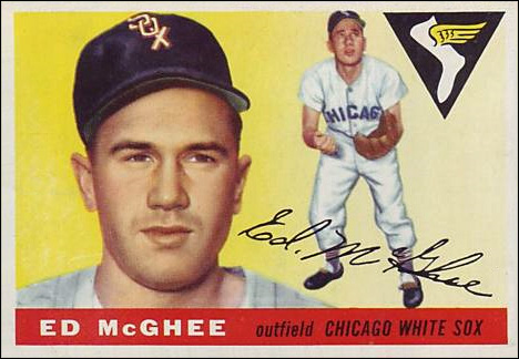
My least favorite of the “vintage sized” sets. Mostly because of the bland backgrounds. The following year’s set would do this same concept much better. No notable cards, and a terribly small checklist. Now I’m having second thoughts about putting this ahead of 1958. At least that set has a good checklist.
#7 – 1954 Topps
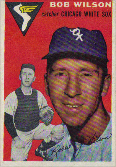
Basically the vertical equivalent of the 1955 set, though it uses photos instead of art. I have 1954 and 1955 basically tied. Very similar design, and small, poor checklist. 1954 gets the nod because it came first, and has a few more cards in the team set. Nothing especially notable, though.
#6 – 1951 Topps (Red Backs and Blue Backs)
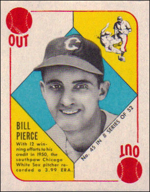
Definitely stands out amongst all of the Topps sets. It’s interesting that they went from the smaller size of these cards to the much larger size of the 1952-1956 sets, and then settled on something inbetween. These are very colorful and fun. The set is this low because it has such a small checklist, though it does feature this Billy Pierce rookie card.
#5 – 1959 Topps
For whatever reason, I feel like this is a pretty iconic set. I do like how colorful it is, though I wish the cards were divided up more evenly among the different colors. Most of the Sox cards are red. It also has a very good checklist, with a few notable rookie cards. Johnny Callison, Norm Cash, and Johnny Romano all have rookies here.
#4 – 1956 Topps
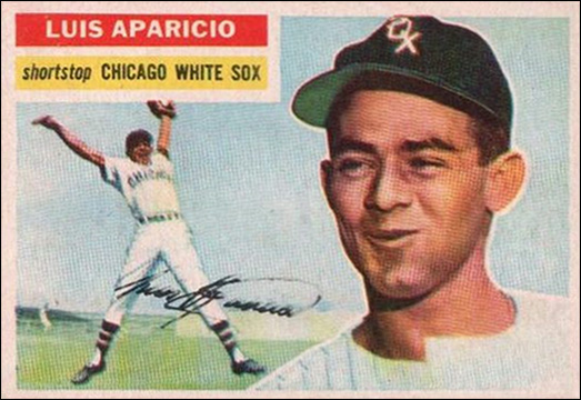
The top 4 of this list are head and shoulders above the rest of the decade as far as I’m concerned. This set features some beautiful, colorful art, and has a solid checklist, including one of the most iconic White Sox rookie cards of all time, the beautiful Luis Aparicio pictured here.
#3 – 1953 Topps
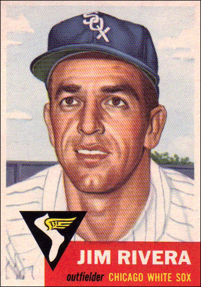
This set features the most beautiful art ever featured on Topps cards, in my opinion. If this set had a better checklist or an iconic rookie card, it might be able to move up the list. I do like the Jim Rivera rookie that is here, though.
#2 – 1957 Topps
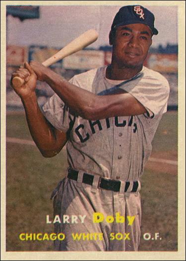
Probably my favorite design of the 1950s. It has such a clean look, and features the best photography of the decade, by far. 1957 has an excellent checklist featuring several legendary Sox players, as well as Earl Battey and Jim Landis rookies. It’s only the iconic status of the final set on the list that keeps 1957 from the top spot.
#1 – 1952 Topps
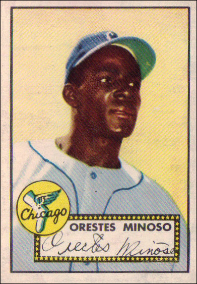
Quite possibly the most iconic sports card set of all time. This set has some beautiful images, a clean design, and a solid checklist. There is no Mantle here, but there is a gorgeous Minnie Minoso rookie card. It would have been almost ridiculous to put any other set at #1.