This is part 3 in my series ranking all of the Topps sets. Click the links to read parts 1 and 2.
The 1970s had some excellent looking Topps sets, and also had some pretty bland ones towards the end of the decade. The Sox weren’t very good in the 70s overall, so they didn’t have a whole lot of interesting players in these sets.
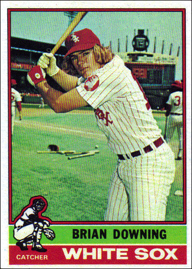
#10 – 1974 Topps
There is really nothing interesting about this design. It’s not terrible, but it isn’t good either. I guess it has some nice symmetry. There is a nice big checklist, and a few interesting rookie cards. Bucky Dent, Jerry Hairston, and Brian Downing.
#9 – 1977 Topps
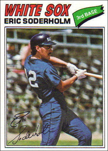
The return of the dreaded facsimile signature. The position inside of the little green pennant is kind of cool. At least a couple of the cards this set have some actual action photography. Another nice big checklist, with lots of rookie cards, but none that are particularly notable.
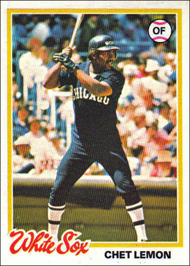
#8 – 1979 Topps
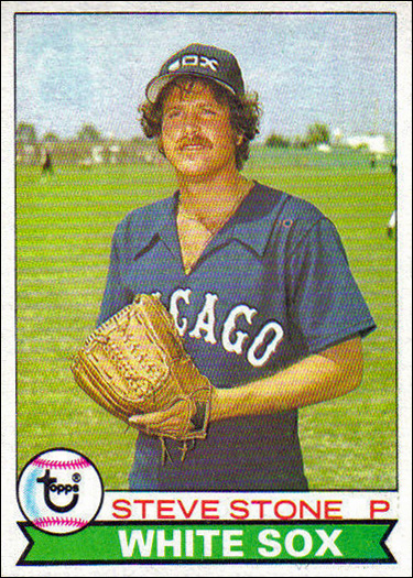
I do like the cute little Topps logo in the baseball, but otherwise this is another bland set. Here we have another good sized checklist, with Mike Squires being the most notable rookie card in the set.
#7 – 1976 Topps
Hey look at this, another boring 70s set! At this this year’s set has cute little baseball man in the corner that represents the position of the player. One thing that 1976 has going for it is the Topps Traded cards, with the cool newspaper headlines. Another big checklist, with Chet Lemon and Lamar Johnson rookies.
#6 – 1978 Topps
The highest ranking of the truly boring 70s sets. I mostly like this because of the script White Sox name. It doesn’t hurt that this is the set that chronicles the South Side Hitmen of 1977. 1978 is also the year I was born, so there’s that. 1978 has a huge checklist, but no notable rookies.
#5 – 1973 Topps
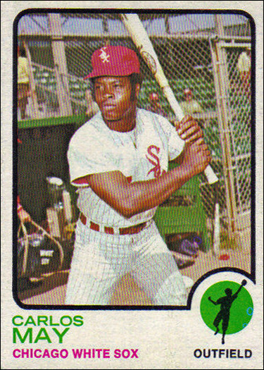
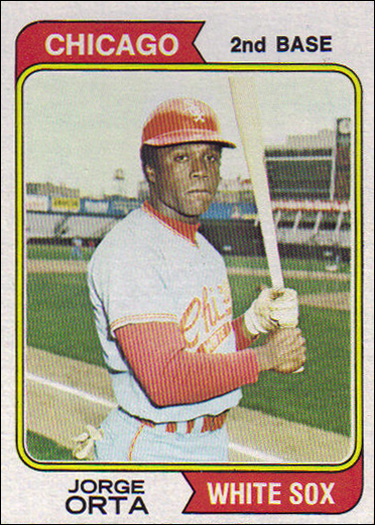
1973 was the first Topps set to include the little baseball man in the corner that represented the position of the player. I also like how that section of card is cut out of the image. It’s a bit more visually interesting than the sets preceding it on this list. Of course we have another big checklist, with rookie cards for Jorge Orta and HOFer Goose Gossage.
#4 – 1972 Topps
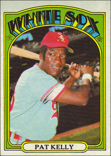
I love that Topps tried something different in 1972. This design feels like it could have been used on a Jimi Hendrix gig poster! There are a whopping 35 Sox cards in this set, which has to be one of the largest team sets out there. Not much in the way of rookies. The most notable one is Terry Forster.
#3 – 1975 Topps
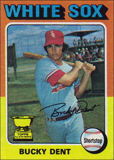
Definitely one of the most colorful Topps designs. The look really suits the era, just like the 72 design does. The Sox are very well represented with various subset cards featuring Dick Allen, Terry Forster, and Nellie Fox. Plus a bunch of 4 player rookie cards, though of the Sox players are particularly notable.
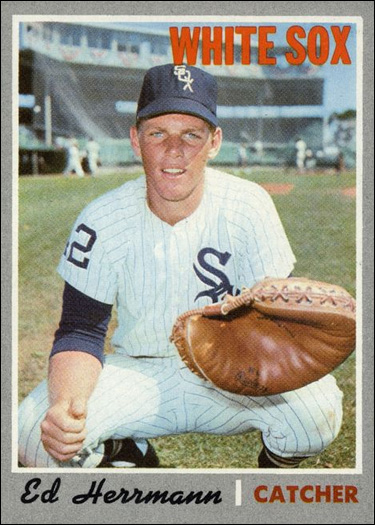
#2 – 1971 Topps
I’m sure you expected this to be #1. If it weren’t for the facsimile signature, it very well might have occupied the top spot. It’s surprising that it took 20 years for them to try a black border, but it really works. The Sox set is a bit heavy on headshots, but they still look pretty good. We have a solid checklist here, but nothing in the way of exciting rookie cards.
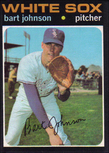
#1 – 1970 Topps
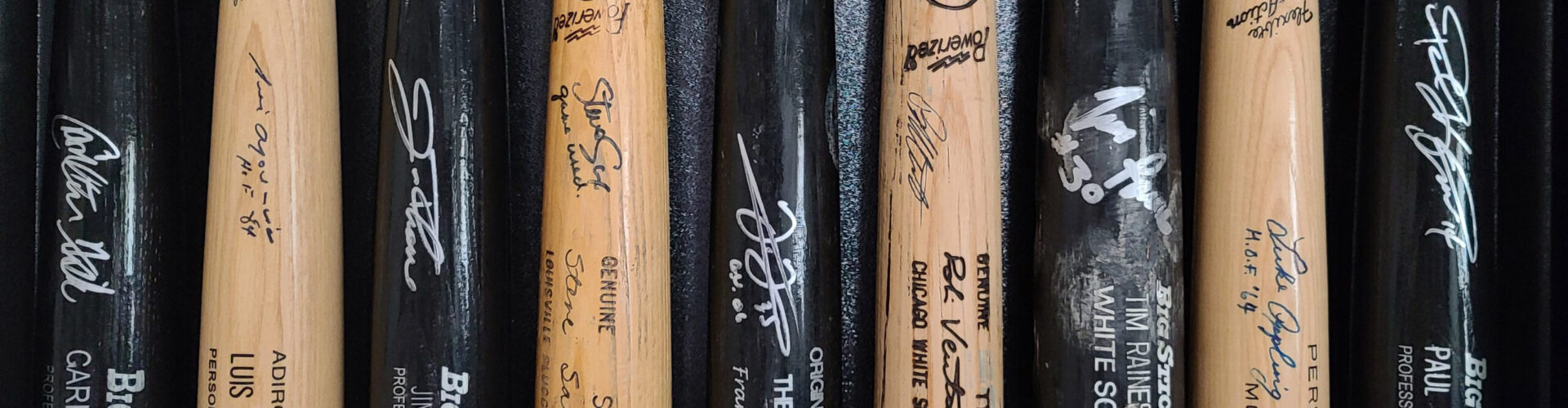
I feel like I’m all alone in my love of this set. I think it has some of the best photography of any Topps set that came before the proliferation of action shots appearing on cards. They also look really good autographed, which is a major bonus in my book. The checklist is solid as usual, but the best rookie here is probably Bart Johnson.