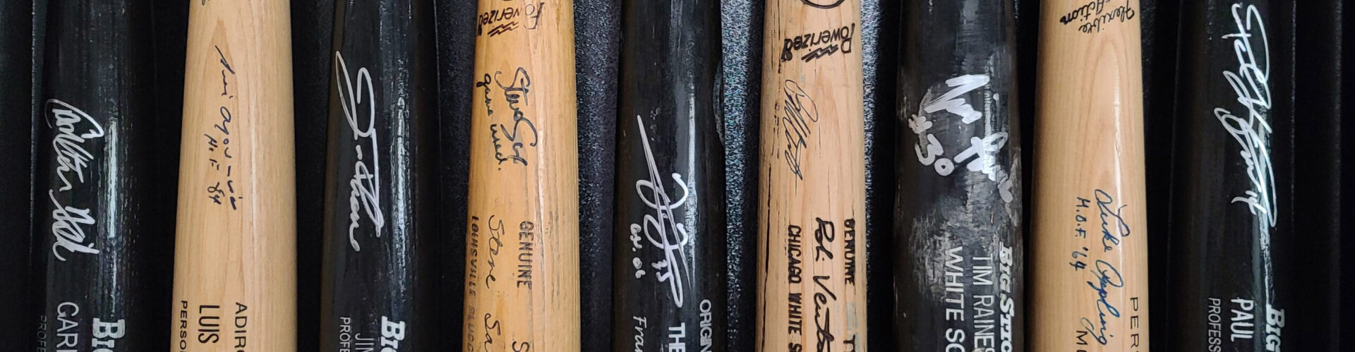
Ah, the 1990s. My heyday as a baseball card collector. I actively collected cards from 1990 until some time in 1997. That was the year I graduated from high school, and at that point I stopped collecting cards for 2-3 years.
I was never a Topps guy. I was always an Upper Deck guy. I still collected Topps cards, but viewed them as second class in comparison to Upper Deck. There was Upper Deck, and there was everything else.
You can read my rankings of the 50s, 60s, 70s, and 80s by clicking their respective links.
#10 – 1994 Topps
For whatever reason, this set has always bugged me. There is nothing overly offensive about the design, it’s just really boring. And I really don’t like the cardstock. It’s kind of glossy, but a very unappealing , half-assed version of glossy. Either make your cards glossy or don’t, I didn’t like this kind of half-hearted attempt. The only good thing about this set is the size of the checklist. They would only get smaller from here.
#9 – 1990 Topps
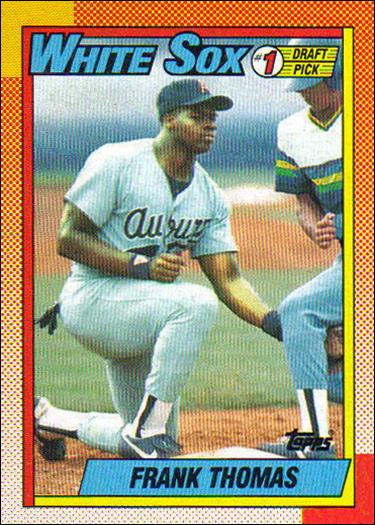
I just don’t understand what Topps was going for with this set. Ugly design, ugly colors, mostly ugly photography. It just has nothing going for it. The only reason this set isn’t in last place is the card pictured to the left. This is my favorite Frank Thomas rookie card, and quite possibly my favorite 1990s Topps card period. But other than that and a big checklist, this set sucks.
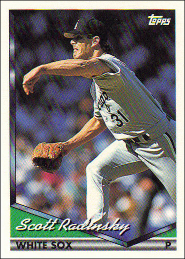
#8 – 1998 Topps
I appreciate that they were trying to do something a bit different here, getting away from the white borders of the previous 7 years, but the design falls flat for me. They would do something similar the following year, but with much more success. This is another set that just doesn’t have a whole lot going for it. There are no good rookie cards, as they missed the boat on Magglio Ordonez and Carlos Lee. And the set only has 15 cards in it.
#7- 1997 Topps
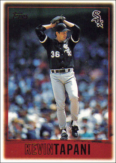
1997 is the year I graduated high school, and the first year where I didn’t collect cards at all. I missed a pretty average offering from Topps. The design is pretty clean, though I wish the inner red border changed based on team colors. My favorite element is the Sox logo in the corner. There are 20 cards in the team set, which doesn’t sound like a lot, but compared to some of the surrounding sets, it’s huge.
#6 – 1996 Topps
1996 eeks out a win over 1997 in a battle of similar designs. They kept the Sox logo, and removed the red border. Both were good choices. They added a little stripe with the player name and a small image of the player’s face taken from the main image on the card. All in all this is a decent looking set, probably the first one on the list. Unfortunately, there are only 14 cards in the set, and for some reason they didn’t include a Mike Cameron rookie here, so there are no good rookies.
#5 – 1993 Topps
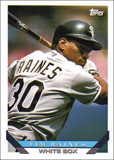
1993’s design is very clean and symmetrical, and is printed on decent card stock. The colors at the bottom change based on the team colors, which I always enjoy. There is some nice photography, and a good sized checklist. They also repeated the Topps Gold parallel set from the previous year, but I wasn’t tired of it… yet. There is nothing super exciting about this set, but I also can’t find anything to complain about.
#4 – 1995 Topps
1995 was the first year that Topps had a geniunely premium look. With the glossy card stock, and gold foil player and brand name, this was a step up from previous sets. It also features some nice photography, and a fairly big checklist. I also enjoyed the Cyberstats insert set. This was a very solid entry for Topps. All it needed was a good rookie card and it would have checked off all the boxes.
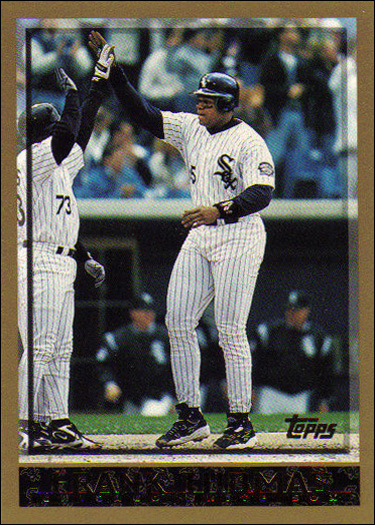
#3 – 1992 Topps
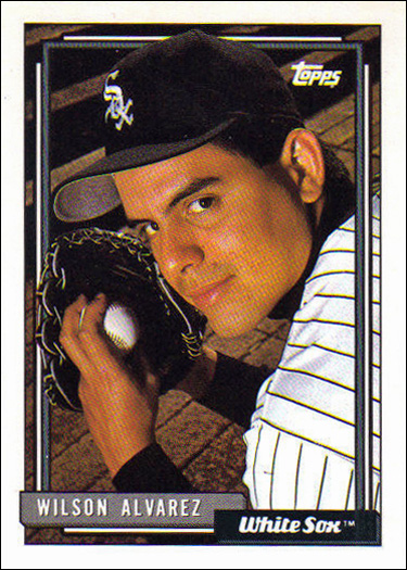
1992 has a classic design that incorporates team colors into the design. It also features some wonderful photography, like the Wilson Alvarez pictured to the left, and a really cool Frank Thomas card. However, I do not like the card stock here. 1991 felt classic and traditional, 1993 felt kind of sleek and modern. 1992 felt like trash. There is a big checklist, and 1992 gets bonus points for featuring the inaugural Topps Gold set. If the card stock were better, this set might be #1.
#2 – 1999 Topps
This is the second set of the decade that had a nice, premium feel to it. There is something about this set that almost feels classy to me. Very clean design, with all of the text positioned in such a way that it feels very unobtrusive. I like the little “Rookie Card” designation next to the player’s name. Nice, glossy card stock. The only thing holding this set back is a pathetic 13 card team set.
#1 – 1991 Topps
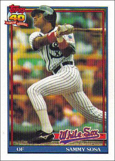
How fitting that the 40th Anniversary release earned the top spot. This set has such a classic feel to it. I like the vintage-ish card stock, the really cool Topps 40 logo, the script White Sox logo, the thin red and blue borders. Everything about the design here works. There is nothing missing. I also love the way on some of the cards where the player is breaking through the border, as you see with Sosa’s helmet in the image to the left. I also love that many of the photos feature the players in their 1917 throwback uniforms. 1991 Topps really knocked it out of the park.