The 2000s are probably the low point for Topps designs. There isn’t a single design I love. There is a lot of mediocrity, and one all-time bad design.
I didn’t collect for most of the 2000s. A bit at the beginning of the decade, and then I started up again towards the end of the decade. So nostalgia really won’t play a part in this segment.
Click the links to view my rankings of the 1950s, 1960s, 1970s, 1980s, and 1990s Topps sets.
#10 – 2002 Topps
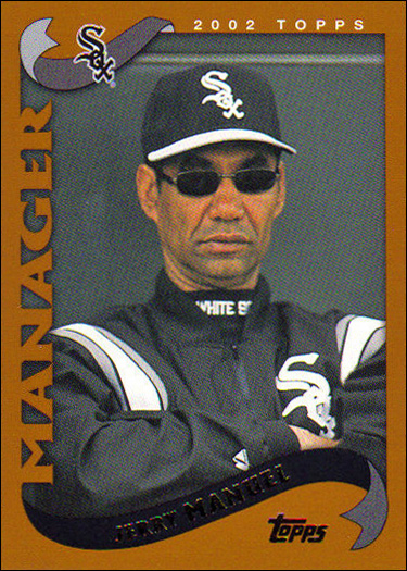
I hope the person that decided on the color of this set was fired. It is soooooooo ugly. I’d rather have a bright yellow border, or maybe a nice lavender, than whatever this is. Funnily enough, the Chrome version of this set is probably my favorite Topps Chrome set ever. That shows that the fault isn’t in the design, it’s solely in the color. Also, there isn’t a cool rookie or huge checklist to rescue the set. Last place it is!
#9 – 2007 Topps
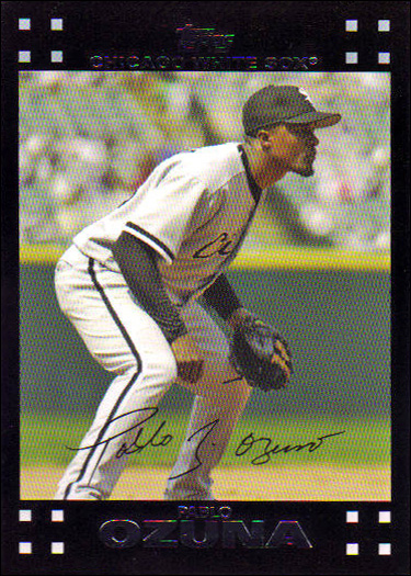
I appreciate the attempted callback to the beloved 1971 set, but this is a bust for me. Way too much of the card is taken up by the top and bottom black borders, and the top is mostly wasted space. The little squares in each corner do nothing for me. And don’t get me started on the facsimile signature. The only saving grace of this set is a pretty large checklist, though there are no good rookies.
#8 – 2000 Topps
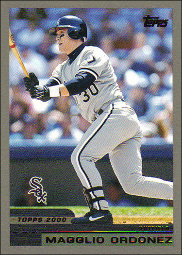
This is a completely unoffensive looking set. If the border were a more interesting color, even white, it might be a bit higher on the list. But this gray is so drab, I just can’t place it any higher. We also have a mediocre checklist here. They totally missed the boat on a Mark Buehrle rookie card, even in the Traded set. Like 2002, the Chrome version of this set is awesome.
#7 – 2003 Topps
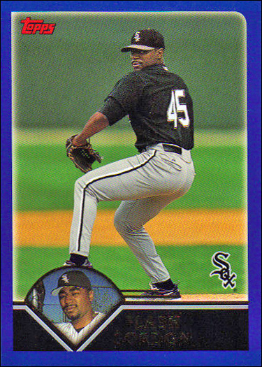
I really struggled with ranking the 2003 set. Why? Well, you see… it’s blue. It’s a really nice, bold shade of blue. But it’s blue, nonetheless. The design is decent enough, and I like the little inset picture at the bottom. But the set is just so… blue. The checklist is fairly large for the era, and there are no notable rookies to speak of.
#6 – 2005 Topps
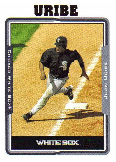
The 2005 set dropped smack dab in the middle of a three year run of similar looking, white-bordered sets. All three look decent enough, and I have 2005 pulling up the rear. Is this the only Topps set that has text along all four sides of the card? In any case, I have no complaints. I do appreciate the large checklist, especially in the Update set.
#5 – 2006 Topps
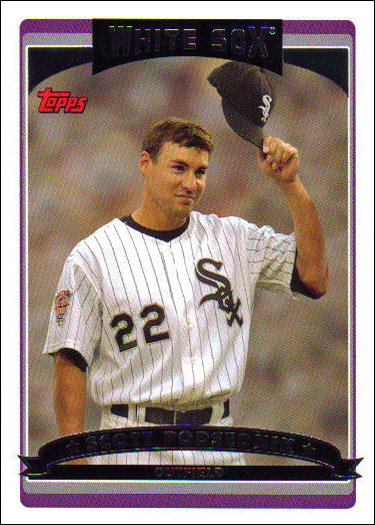
2006 is slightly more visually interesting than 2005, but only barely. This is pretty close to a tie. I think the different angles, and splash of color, are what gave 2006 the edge. I now understand the difficult position Topps is in. By the end of 2006, I was begging them to do something different. And then 2007 came out and I hated it.
#4 – 2004 Topps
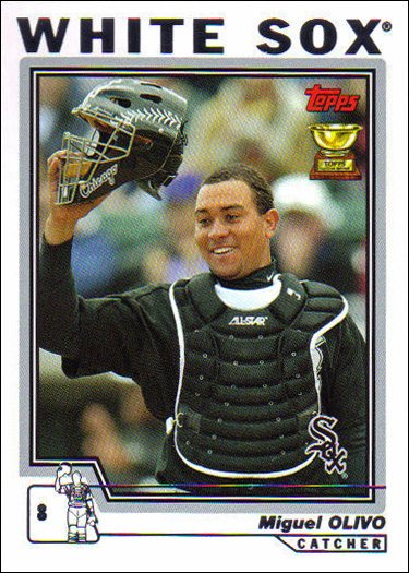
2004 Topps is my favorite of the three mid-2000s white bordered sets. I like the large team name and silver accents. And I absolutely love the little baseball man in the corner that represents the photo on the card. This set is just so clean looking. It also has a good sized checklist for the era. Once again, there are no rookies to speak of, but that was more of a Sox problem than a Topps problem.
#3 – 2001 Topps
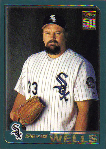
I expected this anniversary release to be lower on the list. I mean, it’s green! It’s a decent shade of green, but the blue used for 2003 was a nicer color. For whatever reason, the 2001 set has a premium feel that no other Topps set of the decade had. I think it’s a combination of the gold accents and cool Topps 50 logo. Whatever it is, the combination gave it a cool look that landed it in the #3 spot.
#2 – 2008 Topps
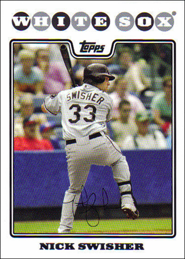
2008 only has one thing separating it from the 2004-06 sets, and that is the really fun way they’ve laid out the team name here. There is also the strange placement of the Topps logo, but somehow it works. It’s all enough to overcome the dreaded facsimile signature. Are there really people out there clamoring for a fake autograph on their cards?
#1 – 2009 Topps
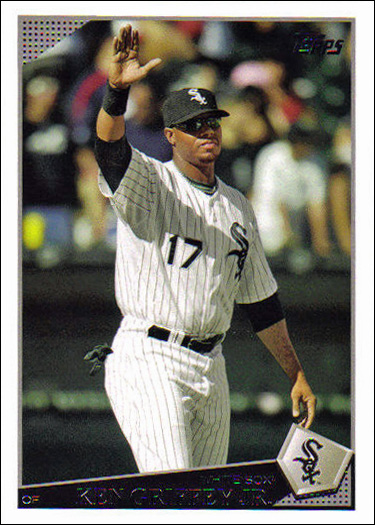
This is my favorite set of the decade, but it’s a relatively weak #1. It has a really nice, clean design, with the little angled home plate displaying the team logo. The photography of the 08-09 sets seems to pop more than most other Topps sets. It’s an average sized team set for the era, but it’s loaded with stars (by Sox standards). There is something about the Griffey (a player I hate) card pictured to the left that is just so classy.
