Carl Everett Private Signing

I sent in 3 cards for a recent Carl Everett signing. I already have Everett on lots of cards, but I still needed his 05 Topps World Series card. So I included a couple other cool cards and sent them in.

Two of the cards turned out great. I’m not very happy with the placement of the signature on the 2005 Donruss Champions bat card. I had a post-it with an arrow pointing at the grey stripe to the left of the bat piece. Instead he signed it the opposite direction of the card, and half in the black. WTF?

Ranked: 2000s Topps Sets

The 2000s are probably the low point for Topps designs. There isn’t a single design I love. There is a lot of mediocrity, and one all-time bad design.

I didn’t collect for most of the 2000s. A bit at the beginning of the decade, and then I started up again towards the end of the decade. So nostalgia really won’t play a part in this segment.

Click the links to view my rankings of the 1950s, 1960s, 1970s, 1980s, and 1990s Topps sets.

#10 – 2002 Topps

I hope the person that decided on the color of this set was fired. It is soooooooo ugly. I’d rather have a bright yellow border, or maybe a nice lavender, than whatever this is. Funnily enough, the Chrome version of this set is probably my favorite Topps Chrome set ever. That shows that the fault isn’t in the design, it’s solely in the color. Also, there isn’t a cool rookie or huge checklist to rescue the set. Last place it is!


#9 – 2007 Topps

I appreciate the attempted callback to the beloved 1971 set, but this is a bust for me. Way too much of the card is taken up by the top and bottom black borders, and the top is mostly wasted space. The little squares in each corner do nothing for me. And don’t get me started on the facsimile signature. The only saving grace of this set is a pretty large checklist, though there are no good rookies.


#8 – 2000 Topps

This is a completely unoffensive looking set. If the border were a more interesting color, even white, it might be a bit higher on the list. But this gray is so drab, I just can’t place it any higher. We also have a mediocre checklist here. They totally missed the boat on a Mark Buehrle rookie card, even in the Traded set. Like 2002, the Chrome version of this set is awesome.


#7 – 2003 Topps

I really struggled with ranking the 2003 set. Why? Well, you see… it’s blue. It’s a really nice, bold shade of blue. But it’s blue, nonetheless. The design is decent enough, and I like the little inset picture at the bottom. But the set is just so… blue. The checklist is fairly large for the era, and there are no notable rookies to speak of.


#6 – 2005 Topps

The 2005 set dropped smack dab in the middle of a three year run of similar looking, white-bordered sets. All three look decent enough, and I have 2005 pulling up the rear. Is this the only Topps set that has text along all four sides of the card? In any case, I have no complaints. I do appreciate the large checklist, especially in the Update set.


#5 – 2006 Topps

2006 is slightly more visually interesting than 2005, but only barely. This is pretty close to a tie. I think the different angles, and splash of color, are what gave 2006 the edge. I now understand the difficult position Topps is in. By the end of 2006, I was begging them to do something different. And then 2007 came out and I hated it.


#4 – 2004 Topps

2004 Topps is my favorite of the three mid-2000s white bordered sets. I like the large team name and silver accents. And I absolutely love the little baseball man in the corner that represents the photo on the card. This set is just so clean looking. It also has a good sized checklist for the era. Once again, there are no rookies to speak of, but that was more of a Sox problem than a Topps problem.


#3 – 2001 Topps

I expected this anniversary release to be lower on the list. I mean, it’s green! It’s a decent shade of green, but the blue used for 2003 was a nicer color. For whatever reason, the 2001 set has a premium feel that no other Topps set of the decade had. I think it’s a combination of the gold accents and cool Topps 50 logo. Whatever it is, the combination gave it a cool look that landed it in the #3 spot.


#2 – 2008 Topps

2008 only has one thing separating it from the 2004-06 sets, and that is the really fun way they’ve laid out the team name here. There is also the strange placement of the Topps logo, but somehow it works. It’s all enough to overcome the dreaded facsimile signature. Are there really people out there clamoring for a fake autograph on their cards?


#1 – 2009 Topps

This is my favorite set of the decade, but it’s a relatively weak #1. It has a really nice, clean design, with the little angled home plate displaying the team logo. The photography of the 08-09 sets seems to pop more than most other Topps sets. It’s an average sized team set for the era, but it’s loaded with stars (by Sox standards). There is something about the Griffey (a player I hate) card pictured to the left that is just so classy.

Carlos May Private Signing

Earlier this week I received the cards I sent in for the Carlos May signing. I have to admit, I am disappointed with the results. A couple of the cards didn’t turn out at all, and the ones that did still look pretty bad. I’m debating bringing it up with the promoter. But I really hate to be that guy.

I still need May on a 16×20 already signed by Dick Allen. I wanted to send it in for this signing, but it was a mail in signing and they would only take it if it shipped rolled. I’ve had very bad luck with that, as nobody else seems to know how to roll a large photo or poster without it getting damaged in shipping.

Ranked: 1980s Topps Sets

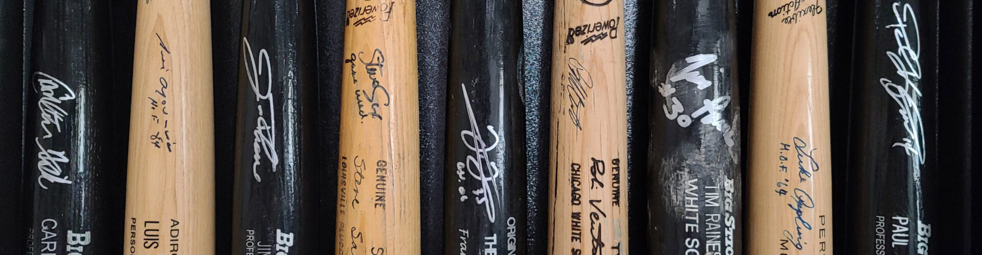
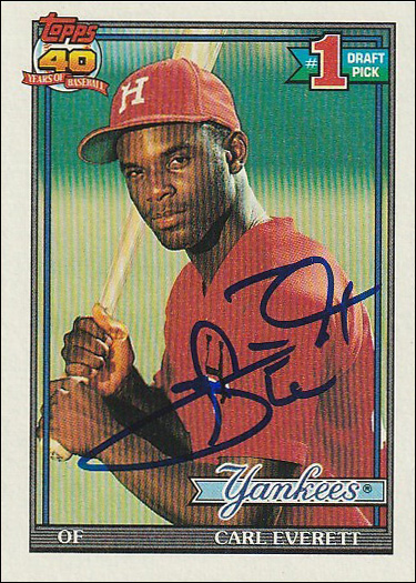
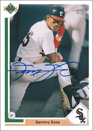
We finally reach the 1980s, during which I started collecting baseball cards. 1986 Topps is the earliest set I remember collecting, though I had some 84s and 85s, so maybe I started a bit earlier. I remember I had a Mattingly rookie, though with my initials written by my mother on one of the back corners, it wasn’t worth very much!

Going forward, nostalgia will definitely play a factor. I will try to limit it’s influence, but I’m only human.
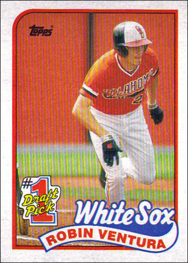
#10 – 1989 Topps

The Topps sets of the 80s kind of petered out as the decade when on, culminating in the 89 set. It’s not ugly, it’s just kind of meh. It’s basically tied with the set ahead of it on this list, so the checklist was the tiebreaker. Technically, the Ventura card pictured here is his rookie, though he has an an 88 card that reigns supreme, IMO.
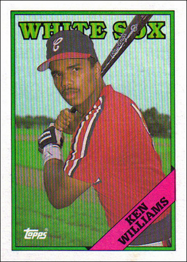

#9- 1988 Topps

Another boring set from Topps. I slightly prefer this to the 89 set, solely because it has a slightly cleaner look. There is a solid checklist, especially once you factor in the Traded set. There is a really cool Baines/Fisk leaders card here. FYI, I consider XRCs to be rookies, and in my most cases, I prefer an XRC. So the McDowell & Ventura cards here elevate the set over it’s 89 counterpart.
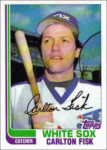

#8 – 1982 Topps

1982 would likely be a bit higher on the list if it didn’t have that ugly facsimile signature. As an autograph collector, facsimile signatures drive me insane. Otherwise, this is a pleasant design, with the dual “hockey sticks” framing the left side of the card. The set has a nice big checklist, but nothing interesting in the way of rookie cards.
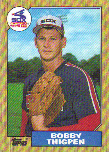

#7 – 1987 Topps

I’m sure you are surprised to see this set so low. I enjoy the callback to the 1962 set, but something about this set bothers me slightly. It has a really muted look. The Traded cards are much more vibrant, and if the whole set looked like that it might be ranked higher. We do have a nice big checklist here, with Karkovice and Thigpen rookies.
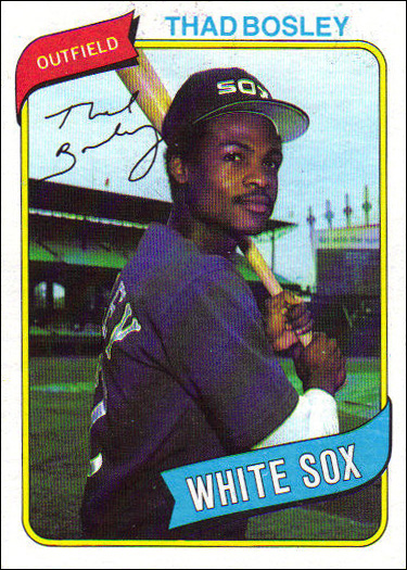

#6 – 1980 Topps

Another set that would likely place higher without a facsimile signature. Am I the only person that hates them? Otherwise, this is a pleasant looking set, with the red position and blue team flags. Another big checklist, but it’s pretty boring. The best rookie card is probably Steve Trout. I don’t know if I’ve mentioned this before, but Steve Trout once serenaded my wife at a baseball card show.
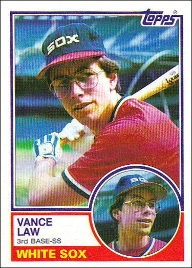

#5 – 1983 Topps

The 1983 Topps set has a nice clean design. It isn’t especially interesting visually, though it did introduce the little headshot of the player next to the player’s name. It has a rather boring checklist, though it is large, as team sets of the era usually were. There is a fun Super Veteran subset here. The base set doesn’t have any rookies, but there is a Ron Kittle rookie in the traded set.
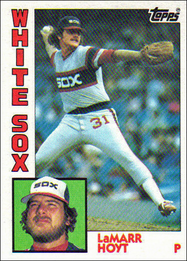

#4 – 1984 Topps

This is where I really start to like the 1980s sets. 1984 Topps is also the first set that I’m nostalgic for. I don’t recall collecting cards in 1984, but the earliest card I remember owning was a Don Mattingly rookie from this set. Granted, my mother wrote my initials on the back, but I still loved that card. This set has an unusual but fun design, the team name down the right side and head shot next to the player name. Another huge checklist, with Greg Walker being the best rookie card.
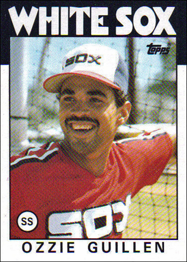

#3 – 1985 Topps

Another fun Topps set. 1985 had an interesting, colorful design, with the slanted team name and position. It also had some fun subsets like the Father & Son and Draft Pick cards. The very large base set doesn’t have any good rookie cards, but the Traded set has Ozzie Guillen and Daryl Boston XRC’s. The Guillen card in particular is one of my very favorite 1980s White Sox cards.
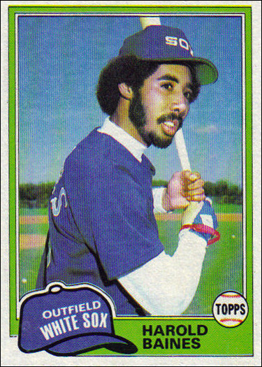

#2 – 1981 Topps

I had a difficult time deciding between my #2 and #1 picks. Ultimately, nostalgia was the deciding factor, which left 1981 in the runner-up position. 1981 had a very fun design, with the little hat bearing the position and team name. I also quite like the Topps logo being on a little baseball. There was some cool photography here, with some of the most 80s baseball photos you’ll ever see. There is also a Harold Baines rookie in this set.


#1 – 1986 Topps

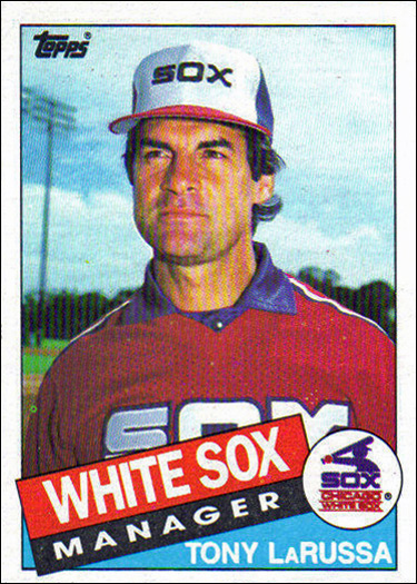
I’m not going to pretend that the placement of the 1986 Topps set at #1 isn’t substantially fueled by nostalgia. This is the first set that I remember collecting in real time. I specifically remember my mom buying me the Bill Madlock card at a baseball card shop in a mall in 1986. I would have been 7 years old at the time. She was a big Dodgers fan, though I never became one myself. The design here is really fun, with the team name in giant letters across the top of the card. The large Sox team set has 4 HOFers (Baines, Fisk, La Russa, Seaver), and a fun Ozzie Guillen rookie card.

Sammy Sosa Private Signing

Tom Orr recently took part in a signing with former slugger Sammy Sosa. Sammy is one of the White Sox all-time “the one that got away” players. Fernando Tatis is the other recent big one, and will probably end up having an even better career than Sosa if he can stay healthy.

Sorry for bringing up those painful memories! In any case, Sammy Sosa signings are very expensive, so I was only able to send in the last Upper Deck card I needed signed. I’m slightly disappointed with the quality of the pen used, but I guess I’ll take what I can get! I am officially done with all Sosa cards that I “need”.

Paul Konerko Private Signing

There was a Paul Konerko signing recently. I have all sorts of items that I need Paulie to sign. But there have been a ton of Sox signings over the last few months, and the last cheap Frank Thomas signing before his prices supposedly go back up is next month, so funds are a bit tight.

Paulie signings are never cheap, and this one was no exception. So I only sent in the 2 cards I needed done the most. Hopefully there will be another signing at a time when I’m a bit more flush, and I can send in a bunch of stuff.


Julio Franco Private Signing

I’ve always liked Julio Franco. I’ve met him numerous times, and he is always friendly and entertaining. He also has a very nice (and slow lol) autograph. Julio only played one year for the Sox, but it was one of the best years of his career. He had a .319/.406/.510 line, good for a 137 OPS+. He also hit a career high 20 home runs.

I have quite a few cards I’d like to have Franco sign. But it was $25 a pop for cards, so I had to limit myself to 4. If he does another signing, I’ll get a couple more cards and a baseball done.


Claude Osteen Private Signing

Autographs Ink recently held a private signing with former Sox pitcher Claude Osteen. “Gomer” Osteen only had one below average season at the end of his career with the Sox, but otherwise had a long career as an solid starting pitcher. He was a 3 time All-Star, and twice won 20 games in a season. He finished his career with a 196-195 record.

Claude only has a couple of cards in a Sox uniform. The signing was an unbelievable $5 per card, so I sent all 4 that I had on hand. I should have gotten a baseball done as well. Next time!


John Cangelosi Private Signing

The folks over at CSAC recently held a private signing with John Cangelosi. Cangelosi didn’t spend much time with the Sox, but did set the AL rookie record for stolen bases by a rookie with 50 in 1986. That record has since been broken, and is currently held by Kenny Lofton. The Major League record is held by Vince Coleman.

I didn’t really need Cangelosi on anything, but the signing was reasonably priced, so I got a few cards done.


Yermin Mercedes Private Signing

Last week BM Authentics had a private signing with the Yerminator himself, Yermin Mercedes. I ordered one of their 16x20s with inscriptions, and I sent in two cards.

It has been a lot of fun rooting for Yermin this year. He seems so lovable. I love all of the Terminator stuff they’re doing with him in marketing. He obviously isn’t as good as he’s been so far this season, but I think he is a legit MLB hitter. It wouldn’t shock me at all to see him at something like .310/.350/.500 with 25 home runs a year for the next 2-3 years.

These Topps Now cards arrived just in time to send in for the signing. And then the stupid post office messed up my tracking. I checked the tracking on the day of the signing, and it said my items were delayed and would be delivered later. So I had missed the signing. But I contacted BM and they said they were pretty sure they had my cards. So I had no idea what was going on. Well, the original tracking number still shows they haven’t been delivered to BM, but I’ve received the return package already. The Post Office really, really sucks.

Here are the items I got signed. I love how they turned out!